画小提琴图的数据格式(箱线图小提琴图)
箱线图 | 小提琴图,如何用合适的图形来展示数据,下面通过2个小例子来系统介绍一下
- R包的安装与加载
package.list=c("tidyverse","ggsci","ggsignif")

for (package in package.list) {
  if (!require(package,character.only=T, quietly=T)) {
    install.packages(package)
    library(package, character.only=T)
  }
}
准备数据集,在此我们使用ToothGrowth数据集
ToothGrowth %>% as_tibble()
# A tibble: 60 x 3
     len supp   dose
   <dbl> <fct> <dbl>
 1   4.2 VC      0.5
 2  11.5 VC      0.5
 3   7.3 VC      0.5
 4   5.8 VC      0.5
 5   6.4 VC      0.5
 6  10   VC      0.5
 7  11.2 VC      0.5
 8  11.2 VC      0.5
 9   5.2 VC      0.5
10   7   VC      0.5
# ... with 50 more rows
注:使用 ctrl shift M可快速打出%>%
下面我们先来做一个简单的箱线图
ToothGrowth %>% mutate(dose=as.factor(dose)) %>%
  ggplot(aes(dose,len,fill=supp))
  geom_boxplot()
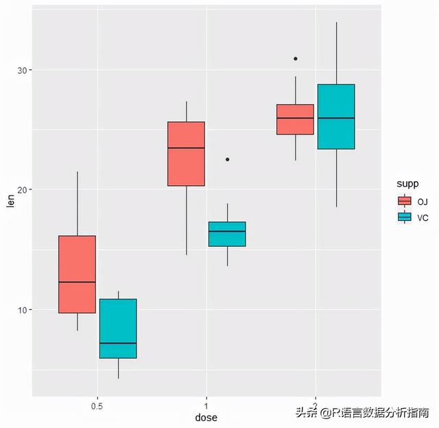
通常绘制箱线图最好添加上误差线,可通过stat_boxplot添加
ToothGrowth %>% mutate(dose=as.factor(dose)) %>%
  ggplot(aes(dose,len,fill=supp))
  geom_boxplot(position = position_dodge(0.7),
               width = 0.5,show.legend = T,alpha=0.8)
  stat_boxplot(geom="errorbar",position=position_dodge(width=0.7),width=0.1,alpha=0.8)

也可以根据does | supp类型进行分面展示
ToothGrowth %>% mutate(dose=as.factor(dose)) %>%
  ggplot(aes(dose,len,fill=supp))
  geom_boxplot(position = position_dodge(0.7),
               width = 0.5,show.legend = T,alpha=0.8)
  stat_boxplot(geom="errorbar",position=position_dodge(width=0.7),width=0.1,alpha=0.8)
  facet_wrap(.~supp,scales = "free")
  scale_fill_jco()

后续就是一些对图例和主题的调整,可以参考之前的文档 ggplot2修饰图例的那些事
下面让我们通过小提琴的形式来重新展示数据
ToothGrowth %>% mutate(dose=as.factor(dose)) %>%
  ggplot(aes(dose,len,fill=supp))
  geom_violin(position = position_dodge(0.7),trim = FALSE,alpha=0.8)
  geom_boxplot(position = position_dodge(0.7),
               width = 0.15,show.legend = F,alpha=0.8,color="white")
  stat_boxplot(geom="errorbar",position=position_dodge(width=0.7),width=0.1,alpha=0.8,color="white")
  facet_wrap(.~supp,scales = "free")
  scale_fill_jco()
  theme_bw()

可以看到小提琴图明显美观很多,同时我们也可以通过ggsignif添加上分组统计信息
ToothGrowth %>% mutate(dose=as.factor(dose)) %>%
  ggplot(aes(dose,len,fill=supp))
  geom_violin(position = position_dodge(0.7),trim = FALSE,alpha=0.8)
  geom_boxplot(position = position_dodge(0.7),
               width = 0.15,show.legend = F,alpha=0.8,color="white")
  stat_boxplot(geom="errorbar",position=position_dodge(width=0.7),width=0.1,alpha=0.8,color="white")
  geom_signif(comparisons = list(c("0.5","1"),
                                 c("0.5","2"),
                                 c("1","2")),
              map_signif_level=T,vjust=0.5,color="black",
              textsize=5,test=wilcox.test,step_increase=0.1)
  facet_wrap(.~supp,scales = "free")
  scale_fill_jco()
  theme_bw()
  theme(panel.spacing.x = unit(0.2,"cm"),
        panel.spacing.y = unit(0.1, "cm"),
        axis.title = element_blank(),
        strip.text.x = element_text(size=9,color="black"),
        strip.background.x = element_blank(),
        axis.text = element_text(color="black"),
        axis.ticks.x=element_blank(),
        legend.text = element_text(color="black",size=9),
        legend.title=element_blank(),
        legend.spacing.x=unit(0.1,'cm'),
        legend.key=element_blank(),
        legend.key.width=unit(0.5,'cm'),
        legend.key.height=unit(0.5,'cm'),
        legend.position = "non",
        plot.margin=unit(c(0.3,0.3,0.3,0.3),units=,"cm"))

通过一系列主题调整图形之后,终于有了一定的美感;但是这还远远不够,针对多组数据我们还有更好的数据可视化形式,下一节带大家继续探索。
欢迎关注我的公众号R语言数据分析指南,下回更新不迷路,
,免责声明:本文仅代表文章作者的个人观点,与本站无关。其原创性、真实性以及文中陈述文字和内容未经本站证实,对本文以及其中全部或者部分内容文字的真实性、完整性和原创性本站不作任何保证或承诺,请读者仅作参考,并自行核实相关内容。文章投诉邮箱:anhduc.ph@yahoo.com


